Typography is a part of our everyday lives whether you realize it or not. You see it in product packaging, street signs, billboards, and anywhere else where you may see words and numbers.
As a graphic designer, I have always been fascinated with the connection between typography and our emotional response to it.
Believe it or not but typography is actually very similar to fashion. You can think of your font choice the same as the outfit that you wear when meeting potential customers. Just like clothing, every typeface style has a personality and will give people an initial impression of who you are as a company.
With a few tips, it’s actually easy to make an informed decision on typography that will benefit your business.
Typography:
/tī pägrəfē/
noun
The style and appearance of printed matter. The art or procedure of arranging type or processing data and printing from it.
Tip 1: Choosing the Correct Fonts for Your Brand.
Every consumer in the world, whether consciously or not, will judge your brand based on the style of your typography. Here is a little cheat sheet to help you understand typeface styles:

Your typography loving designers will appreciate your newfound knowledge!
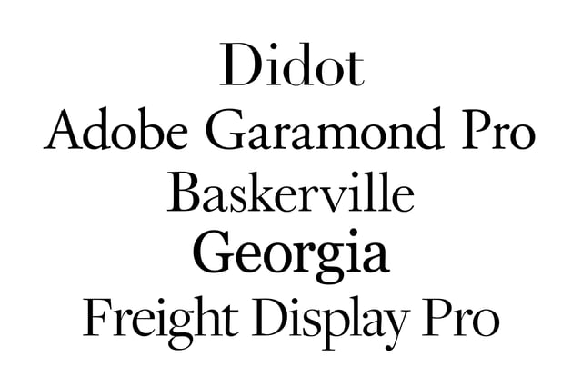
Serif:Examples of Serif fonts are Times New Roman, Didot, and Baskerville. These fonts are perceived as traditional, easy to read when printed, and good to use when trying to convey a trustworthy, traditional, serious, long-established, and/or classic brand.
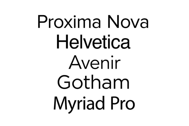
san serif fonts are perceived as
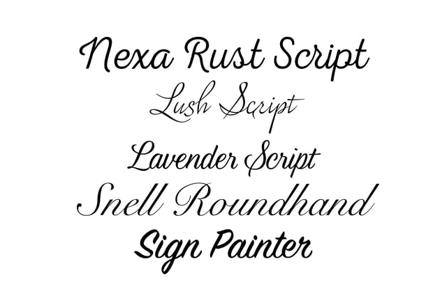
Script typefaces are perceived as elegant. However, they should be used sparingly and not for body text. They come to good to use when trying to convey an expensive, lavish, upscale, and/or stately brand.
Display typefaces,

Another thing to also keep in mind when choosing a typeface is
Choosing two or more fonts to pair together can be tricky. You want complementing fonts that are not too similar to each other but also not so different that they clash. This often results in a long process of experimentation until you find something that “just works.” Although this process is typically one of preference, instinct, and lots of practice; it can be made easier with a few tips.
Font pairing tip 1: Find similarities.
Fonts that look notably different from each other but have a similar feature will typically work well with one another. The most popular principle for combining typefaces is to pair a sans serif header with a serif body. Here's an example of font pairing:
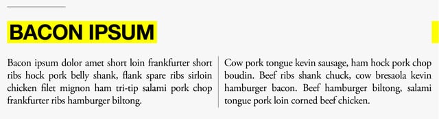
Helvetica Neue and Garamond are a commonly used combination because those typefaces work well with each other. Each typeface has similar character height and similar shapes in each character, however they don’t look too similar because Helvetica Neue is a sans serif and Garamond is a serif.
Font pairing tip 2: Give Your Fonts a Job.Your chosen fonts will need to complement one another but will also need to be different enough to create a clear hierarchy in your typography. This will give consumers a visual map so they know where to look and know what is important.
Font pairing tip 3: How many fonts should you use?
The general rule when it comes to the number of fonts being used is a maximum of 3 per design. Typically, if you use more than this, your design will begin to look like a mush pot of random information that consumers will have a hard time understanding. However, typography is an art and rules in art can always be broken so don’t be afraid of using more than 3 if it works.
Tip 3: Where to Get Fonts
If you want to try your hand at typography but don’t want break the bank from buying fonts, you can always check out some of the following sites. There are plenty of sites (some better than others) that offer free font downloads. Here are a few to get you started:
Font Squirrel, Google Fonts, Dafont, 1001 Fonts
Not all of these following sites contain free font downloads but they all have great options and provide great inspiration.
Typekit, Fontfabric, Typewolf, Pinterest
In closing, keep your options open and play with different font styles until you find the one that best represents your brand. Don't forget to check out our website or contact us directly at info@pulsemarketingteam.com.