We did it! We've made it to the new year! Welcome to a time of celebration and change. Along with new year's resolutions, there are many new trends coming to every industry in 2018. As a graphic designer, I have been the most interested in typography trends. Therefore, I have picked 6 of my favorite typography trends that you can look forward to in 2018.
-
Cropped Typography
This is one of my favorite upcoming trends. Introducing itself in 2017, cropped typography is a trend we can look forward to seeing a lot more this year. Simply put, cropped typography is the act of erasing parts of letters, while making sure that the text is still legible. This can create a really cool effect if done right. It can be laid over images, intertwined with other elements, or used as a stand-alone element.
-
Text Laid Over Images
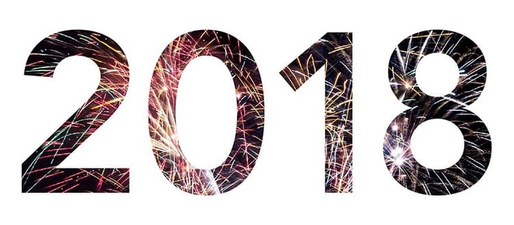
Here's another trend that began in 2017, but will be taking off this year. Essentially, it's exactly how it sounds. This is when text is cut out from an image and then the cut-up image is laid over another image. The text is typically cut-out of a solid colored image and then placed over a picture, so that the colors of the picture may pop through the text. This is one of those trends that can be used subtly or dramatically.
-
Typography As Real-Life Elements
This is a great way to intertwine typography with other elements. By scaling the type to interact with an element, the illusion of type as a real-life object is created. I've personally seen this done a lot within images to interact with people or nature. Using typography as real-life elements is a great way to work on those photoshop skills. This can be done with big letters, small letters, and other elements. Feel free to let your creativity take the wheel!
-
Metallic Elements
Metallic Elements are a fun way to make your design pop. This can be done by using metallic type, objects, or textures. This is often combined with other trends such as creative typography, photography, and 3-D design. When done properly, this trend can create the effect of a real-life composition.
-
Gradients
Gradients are another one of my favorite trends that we can look forward to in 2018. Not only is this something that can be designed into the background or image of a design, but it is becoming more popular to use in typography. This is a fun trend because it can be done subtly or in full-force. Additionally, it often creates a nostalgic feeling of the 90's, while also feeling more modern when done with other recent design trends.
-
Chaotic Typography
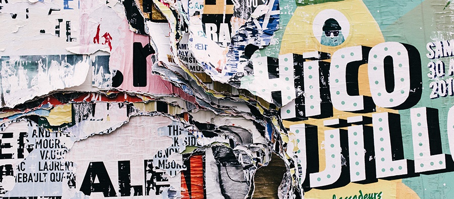
Last, but not least, we have chaotic typography. As a perfectionist who loves symmetry, this trend is the hardest for me to embrace. On the other hand, I can't help but admire it when done well. This is when typography is arranged in a way that looks like chaos but is still legible. It can be done with small type, large type, a lot of imagery, no imagery, etc. This is another trend that can be done with extreme creativity or simply.

And there it is! 6 of my favorite typography trends that you can look forward to in 2018. I hope you have fun spotting these different types of typography while searching for more throughout the new year.
Sources:
Top Graphic Design Trends 2018: The Ultimate Guide. Graphic Mama Blog. November 2018. https://graphicmama.com/blog/graphic-design-trends-2018/
Typographic Trends To Look Out For In 2018. Ultralinx. September 28, 2017. https://theultralinx.com/2017/09/typographic-trends-to-look-out-for-in-2018/
Don't forget to check out our website or contact us directly at info@pulsemarketingteam.com.

