Who else here has struggled with combining fonts? I definitely have and that’s okay. I could be wrong, but I’d like to say all graphic designers have, especially when starting off. The struggle is just a part of the learning process.
Here are 5 things I’ve learned about combining fonts so far:
- Hierarchy
The first thing I learned when it comes to choosing typefaces, is to decide which part of the design requires attention first. This could be the title or the main point of information.
Establishing hierarchy sets up a path within the design for the consumer’s eye to follow. It allows for you, the designer, to decide in what order the consumer takes in information.
In order to use this superpower in the most effective way possible, you may choose to go with a bold and all caps typeface or possibly a typeface with a lot of character. This way, the text will stand out.
- Follow the Rules, but Sometimes Don’t
After choosing your hierarchy #1 typeface, it’s time to decide what other fonts you will be using. It’s a good rule of thumb to use 2-3 fonts total, but all design rules are made to be broken, right?
Try everything, especially if using more than three fonts is relevant to the time period or theme you are designing for. For example, if creating a more vintage-style design, it may make sense to use many different fonts.
- Contrast
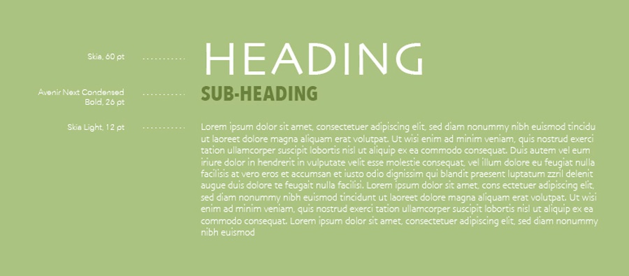
Combining serif and sans-serif fonts is a popular design technique. The reason this is so popular may be due to the general need for contrast in design. Contrast is used to help create the visual hierarchy we previously discussed.
This can be done with multiple font families or within one font family. For example, you could choose a bold font for your heading, a thin italic and serif font for the sub-heading, and maybe a regular version of your heading for the body copy.
If you decide to use one font family, it’s wise to choose one with many variations such as, Avenir. This is one of my favorite fonts for a few reasons, but one is that it has many variations ranging from Heavy to Ultra-Light.
Also, be sure to avoid fonts that are too similar or too different. This may ruin the hierarchy by causing distraction or confusion.
- Be Intentional
If using multiple font families in a design, choose fonts that not only create a nice contrast, but also have similar personality types. This will help ensure you are intentionally choosing fonts that give off a combined sense of the intended mood.
It's similar to picking colors. Color psychology should play a large role in what colors you decide on, if better connecting with your target audience is your goal. Choose fonts that complement each other and work together toward the overall design's purpose.
- Practice, Practice, and Practice Some More.
Ultimately, every skill takes time to master. You can’t become the best at anything without practicing. So, next time you are working on a design piece, really pay attention to the font pairings you are choosing.
Do they complement each other’s personalities? Do they create a nice contrast that helps convey hierarchy? Are you following basic design rules? If not, why?
My challenge to you is to question yourself more while designing. Do this often and you will become a better designer.
Sources
https://www.canva.com/learn/combining-fonts-10-must-know-tips-from-a-designer/
https://www.canva.com/learn/the-ultimate-guide-to-font-pairing/

