Gestalt is a psychology term which means "unified whole". It refers to theories of visual perception developed by German psychologists in the 1920s. These theories attempt to describe how people tend to organize visual elements into groups or unified wholes when certain principles are applied.
These principles can be seen in all forms of graphic design. Incorporating these principles into your designs helps to create more unique and interesting designs.
Similarity

Similarity occurs when objects look like one another and they can be perceived as a group or even a pattern. The Sun Microsystems icon below is created from different objects but appear as a single unit because they are similar in shape and grouped near each other.
Continuation

Continuation occurs when the eye is compelled to move through one object and continue to another object. In the space logo below, the cutout section running through the letters draws your eyes and leads them to the star. This gives the effect that the star is “shooting” across the letters.
Closure
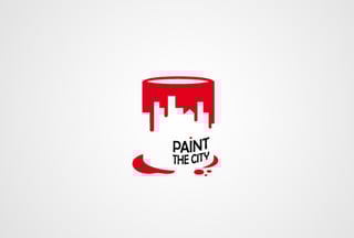
Closure occurs when an object is incomplete or a space is not completely enclosed. If enough of the shape is hinted at, people will be able to perceive the whole by filling in the missing information. The Paint the City icon is only defined by the paint that is spilling out of the “bucket”. The bucket does not actually exist and it is not defined, but based on the form created by the paint, it alludes to the bucket being there and our minds fill in the blank.
Proximity

Proximity occurs when elements are placed close together. They tend to be perceived as a group. Even though objects may vary in size, shape or color, if they are near each other, they can be perceived as one single element. The IBM logo is essentially just different horizontal shapes, but due to their alignment and proximity to each other, they are perceived as a group and create a shape. In this instance, the shapes create the letters IBM. If the shapes were scattered and in varying locations, they would appear as separate shapes and the unity would not occur.
Figure and Ground

The eye differentiates an object from its surrounding area. A form, silhouette, or shape is naturally perceived as figure (object), while the surrounding area is perceived as ground (background). Creating a balance between figure and ground can make the perceived image clearer. Using unusual figure and ground relationships can add interest and subtlety to an image. A prime example of this is the Spartan Golf Club logo. At first glance it may appear to be a Spartan with his helmet because the name of the company will help trigger that image, but after looking at it some more you will see a silhouette of a person playing golf. This logo uses the negative space between the shapes to create these images. It shifts the perspective of the figure and background and it can switch to depict both images.
Don't forget to check out our website or contact us directly at info@pulsemarketingteam.com.