Composition is one of the most important elements in design. Having a dynamic composition will make for a more successful design overall because it is more interesting and will draw the audience’s attention. Composition is the art of organizing elements in a design into a harmonious and pleasing whole. It is important to take into consideration how objects are placed in a design or work of art.
Here are some simple tips to incorporate when creating your compositions:
Overlap
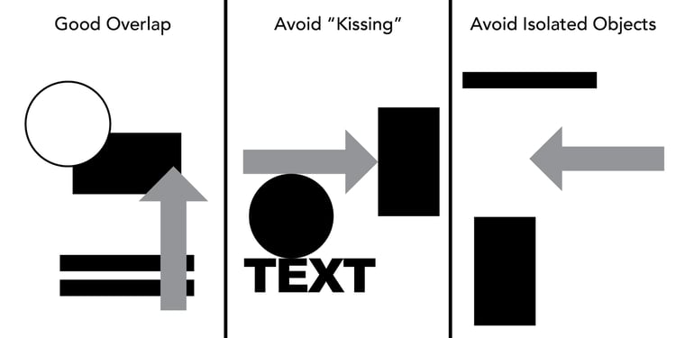
One way to create movement in a piece is to place objects slightly over one another. This overlapping makes your eye move from one object to another and makes it so all information can be taken in. Avoid having objects that just simply touch each other. Avoid “kissing”, having objects just touching each other by their edges. You also want to avoid having isolate objects. Objects that just float in space do not look like they are incorporated with the rest and may seem out of place.
Crop
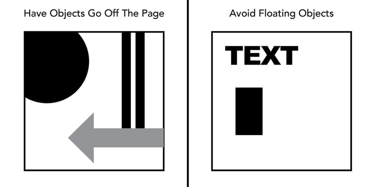
An easy way to enhance a composition is to have objects going off the page. You do not want to have important information run off the page, but having secondary design elements run off the page at different sizes will add dynamics and make the overall design more interesting. This gets the viewer in and out of the picture. Avoid having floating objects.
Rotate
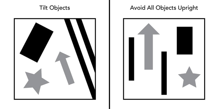
Another tip that can be used to break the monotony of some designs is to consider placing objects at an angle. Having things that are tilted adds movement to the design. This tip may be difficult to incorporate in some designs, but when it works, it makes a difference and can be what elevates the design to the next level. Artwork with objects that are perfectly lined up with the edge can be boring and unexciting.
Focal Point
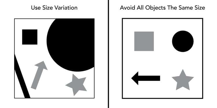
In a design, it is important to create an area of importance. Having an emphasis gives the viewer something to draw them in and something to focus on. This can be achieved by having a size variation or color dominance. Make the object you want to be the focal point larger than the rest, or a different color, and it will stand out amongst the rest of the objects. Try not to have all elements the same size because there will not be any hierarchy created.
Off-Center and Asymmetry
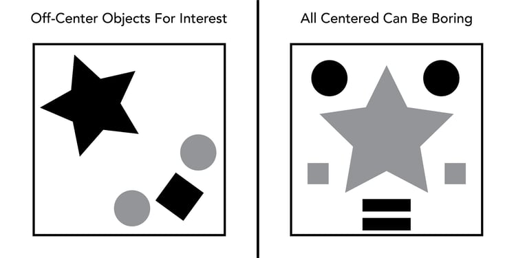
Avoid placing objects directly in the center of the page. Placing objects off to one side will create a more interesting composition. While objects are placed off-center, they overall design should still be balanced. Balanced could be achieved by having one large object one side being balanced by three smaller objects on the other. Symmetrical designs can still be successful, they are just not as exciting and dynamic as asymmetrical designs.
http://www.swcta.net/teachers/tomme/graphicdesign1_projects/composition/composition.html
Don't forget to check out our website or contact us directly at info@pulsemarketingteam.com.

