Although we are well into 2017 by now, it’s never too late to catch up on the trends that you should be aware of this year. You don’t always need to follow trends if they don’t work for a specific project or client, however, they will help guide you and show you where you should be looking for your inspiration throughout the year.
2016 was a stressful, controversial, and just plain weird year for most people. At the turn of the year, many people were looking to get away from the drama, come together, and regain harmony with one another. Pantone Universe® set the stage for this theme when they named the 2017 color of the year: Pantone Greenery. The refreshing shade of green is symbolic of new beginnings and as Pantone Universe® puts it, “evokes the first days of spring when nature’s greens revive.”
This will be a year full of authentic photos, bold typography, loud colors, google fonts, hand drawn graphics, traditional minimalism, gifs, and vibrant duotones. Here is a breif overview of current trends, what to expect with each of them, and how each of them may or may not affect the way that you design.
Returning to Our Natural, Organic Roots:
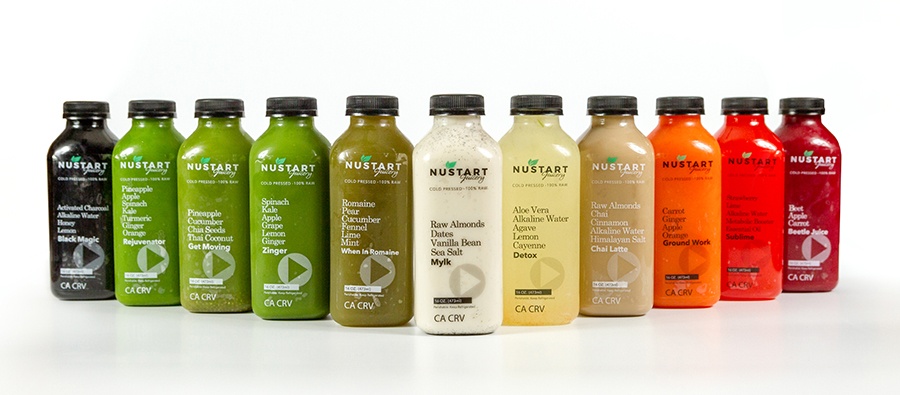
2017 is the year that we are returning to natural and organic oriented design. If you are in your early adulthood, this is most likely nothing new to you since this has been a popular trend for a few years now, but this style is now becoming more mainstream. Upcycling, alternate farming methods, and the millennial generation’s craving for raw, natural products will influence visual trends within photography, graphic design, illustration, interior design, and even fashion. This has become very apparent in photography and package design. Many companies (especially in the food industry) are using packaging with open windows, which allow consumers to look past the packaging and see exactly what it is they are purchasing.
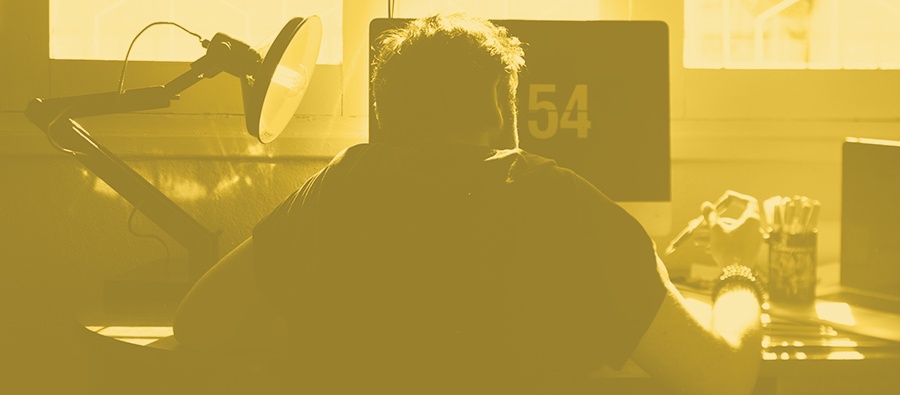
The same philosophy can also be seen being applied to photography. With people’s craving for ‘natural and organic’, we can finally say goodbye to cheesy and posed stock photography! Photographers and designers are taking a more natural approach to photography in photo editing as well as the subjects, which they are shooting. Although this trend has been around for a while now, the film look in photography is becoming more commercial rather than just an effect applied to every hipster’s photo uploaded on Instagram. There is a fine line between 2012 Instagram filters and professional photo editing, so be careful when jumping into this trend, especially if you are new to photography and/or photo editing. VSCO makes excellent presets for Adobe Lightroom and Photoshop so VSCO is always a great place to start until you feel comfortable doing edits completely from scratch.
Design, Color, & Branding:
Over the past few years, many designers were using soft, muted colors in their designs. This was a movement partly brought into the design world by Apple. The visual trend was formed in order to show an upscale, ‘futuristic’ feeling, which implied that we were already in the future seen in many science fiction films. This year, we will start to see 2 distinct color trends that in many places will take place of muted color schemes. Bold colors and bright monochromes have been easing their way into recent works from many different companies including Spotify, Google & Instagram. This doesn’t mean that your work has to look like a unicorn frappuccino blew up on your artboard to stay relevant. Subtle hints of bright color may be enough to make a big difference. Infusing bold accent colors with neutral backgrounds will also allow minimalist companies to obtain a fresh look without losing their minimalist look.
As with the organic style trends that I mentioned above, this is definitely not something specifically new to 2017. Many of these trends derive from Google’s material design style guide that was released in 2014. I would highly recommend looking it up if you haven’t already. It will give you a better understanding of where these trends are coming from.
In conclusion:
The overall driving point of design this year is the stand against the sterile, overly white and too perfect aesthetic that tech industry has pushed over the past few years. Science fiction design was exciting for a time but it has left designers with a craving for color and excitement in their work.
This year we are beginning to see a whole new approach to design in things that have been stagnant for too long. It will be intense, innovative, beautiful and absolutely, refreshing.
Hopefully, we taught you something new. Don't forget to check out our website or contact us directly at info@pulsemarketingteam.com.
