As a designer, one of the most tedious things to work with can be typography. A design can either be made or broken depending on the typography. Many designers fear using typography or just have no purpose behind their choices at first, but you just need to learn how to use it effectively.
Aside from grammatical and spelling errors, there are other factors that can ruin the typography of a piece. As designers, we need to train ourselves to spot some of these issues and learn to make the proper decisions in the selection of typographical styles.
We need to avoid committing these typography sins.
- Choose the Right Typeface from the Start
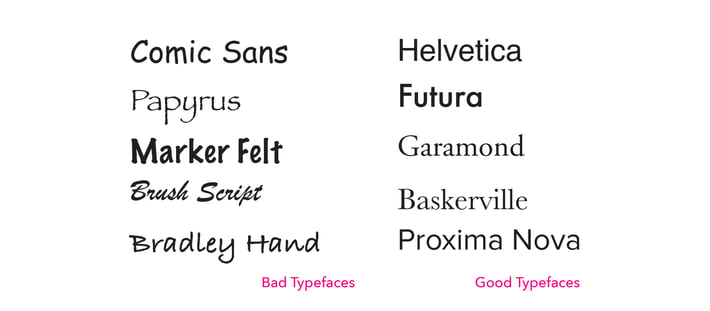
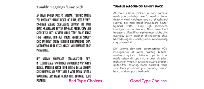
It is essential to begin with the proper fonts or typefaces so that it does not throw off the project down the line. This topic can be subjective and there are some arguments about which typefaces are good and which are bad, but there does seem to be some sort of consensus on the matter and it is wise to generally follow it.
For the most part, everyone despises Comic Sans and everyone seems to agree that Helvetica is a good font. It is mostly a topic of finding a typeface that fits the desired tone of the project. Researching typefaces can help us avoid using ones that are overused, unprofessional or illegible.
- Limit Yourself
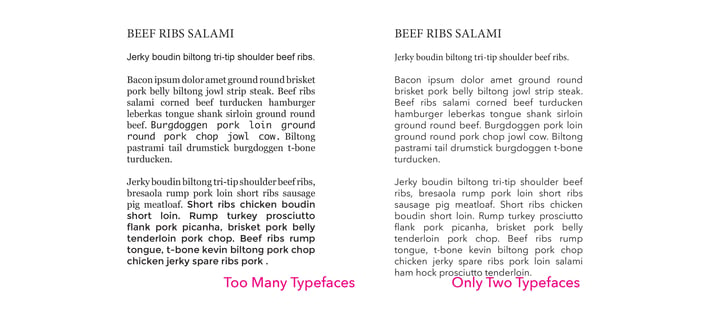
It is important to be selective with your typefaces. You do not want to use a bunch of varying typefaces just because you have them at your disposal. Using too many typefaces can make things look hectic and difficult to read. You want to try and keep it to two to three typefaces maximum; one for headers, maybe one for sub headers and then one for the body copy. Just keep it simple and clean.
- Pair the Typefaces Thoughtfully
A part of selecting the proper typefaces is choosing ones that work well together. You do not want to use type that will clash with each other to where it makes it hard to follow or look at. Certain typefaces work better as headers and other work better for body copy. Usually a mixture of serif and sans-serif typefaces work well to balance each other because one is simpler while the other is more decorative. Using two serif fonts can be overwhelming due to the extra decoration those typefaces tend to have.
- Hierarchy, Use It
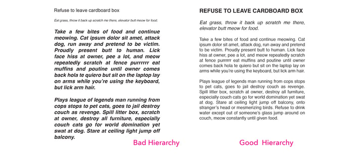
Hierarchy is used to show and give importance to certain items. Usually the title is the most important because it is what grabs the audience’s attention, then comes the sub header because it gives a bit more information on the topic and is short and to the point. Finally, comes the body content. While the body is important because that is where all the information is stored, that is not what draws people in. The audience is first brought in by the header and sub headers, then if they have made it that far, they will usually read the body.
Some ways to implement this hierarchy is to use different typefaces for the header and sub headers so that they stand out compared to the body. Also, changing the sizes will demonstrate the level of importance as well as using bold or italicized versions.
- Have Faith in Your Typeface
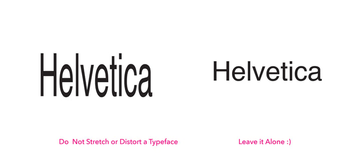
The typefaces we use were created by other designers and for the most part were created purposefully. There is no reason to distort or stretch a typeface to fit a specific space. If the typeface is not working, change the size or just try another typeface. The typefaces were designed a specific way and if they get distorted, it just throws them off and they simply do not look good and will often look like a mistake. If the typeface is too wide, try using a condensed version of another typeface. Do not ruin all the time and effort that it took the designer to create the typefaces by destroying them.
- Kerning, Tracking, and Leading
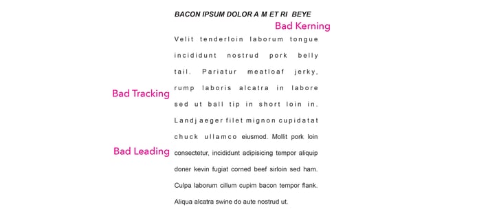
Each of these three concepts do something different, and if used properly, they work together to make a cohesive and clean look. Kerning refers to the space between two letters within the same word. Sometimes there needs to be an adjustment because certain typefaces may have certain letters too close or too far apart from another, but it is important to not overdo it and create random spaces throughout the type.
Tracking is the spacing between each letter. Again, sometimes this may need adjustments, but you do not want to make it too small and have the letters lying on top of one another. Nor do you want them far spaced out, making each look like individual words.
Bad leading is a common issue that makes designs look off, but can easily be adjusted. Leading is the spacing between lines of text. This is often adjusted to make certain blocks of text fit a certain space, but overdoing it no longer makes the body copy look uniformed and each line begins to look like its own separate entity. Also, making the leading too small makes all the lines of text look squished together and it becomes difficult to read due to the lack of space between each line.
- Choose Colors Wisely
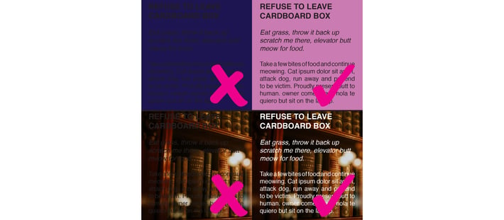
Color can really add something extra when working with type. Choosing the right color is essential. You need to make sure that the color has a strong contrast to the type. You do not want the type to blend in with its background and make it difficult to read. If black text is not working on the color you have selected, it is because it is not a strong enough contrast, change the color or try white text.
- Only Justify if You Need To
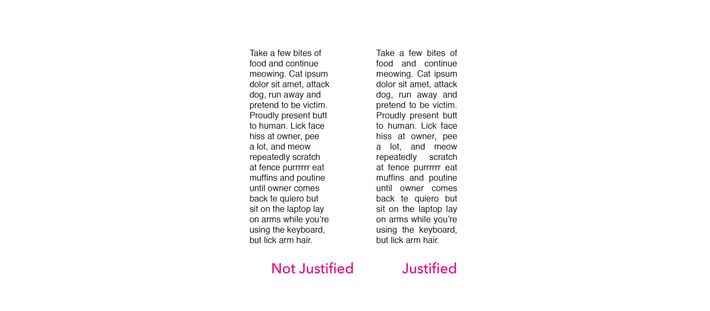
Justifying body content is a good idea to make all the paragraphs look uniform and even. It is highly suggested to justify body content, but only if you must. If the body copy looks lined up enough while being left aligned keep it that way; sometimes justifying the body creates large spaces, called rivers, between words and they make it look unpleasant. If you can avoid creating these rivers in the content without justifying it while somewhat keeping the edges aligned, go for it.
- Keep the Rags Clean
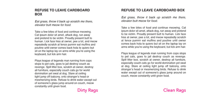
Going back to the importance of justifying body copy, if you do not justify it, chances are that your rags will be all over the place. Rags are the ends of each line and how they line up to the rest. Justifying text makes it so the rags are even and it gives the body copy a blocky feel. This is the look you want to achieve. Having your rags end at different places makes the edges look choppy and sloppy.
- Look Out for Orphans and WIdows
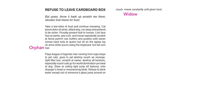
Orphans are single words that are left on their own line at the end of a paragraph; don’t leave them hanging there all by themselves. They should be worked back into the rest of the paragraph. Adjust spacing or simply rephrase the sentence so that it does not leave the single word on a line by itself.
Widows are lines of text that get separated from the paragraph due to lack of space and get added to the next column. They end up as a single line of text on a new column to themselves. These too should be reworked to fit with the rest of the paragraph. Having orphans or widows can ruin the flow for the reader and they do not look good.
Don't forget to check out our website or contact us directly at info@pulsemarketingteam.com.
